The new Button Bar layout object provides developers with an improved method to manage a cluster of buttons that have functional and/or cosmetic similarities.
Navigation
A Button Bar’s most obvious use is for navigation. Let’s say you want a horizontal navigation bar that allows your users to navigate to different layouts. Each button should represent a distinct destination, and the buttons should have a similar appearance, position, and behavior on each destination layout.
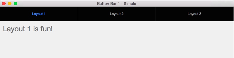
A single button bar can be configured to include one button for each destination layout, and each button can have its own distinct response to a click (just as a traditional button can), either calling a script or an individual script step (or a popover button, but we’ll get to that). The developer is still charged with replicating the button bar across all the destination layouts, and positioning the objects consistently; but having a single object is much handier than even a group of buttons, for a variety of reasons (they never accidentally become decoupled; I can interact with the individual buttons without ungrouping, etc.)
Using the new Top Navigation part ensures that the navigation bar stays on top of the window, no matter how far down the user scrolls.
When it comes to resizing your window, button bars behave more like a tab panel than a group of buttons: if anchored properly each button will gracefully widen, taking its fellow buttons into account. So gracious.
For more complex navigation schemes, it might be more appropriate to leverage the button bar’s other dominant feature, the popover button. Now, I must be dreaming, because this layout object seems to have it all: it can be a button, or a popover button, or a mixture of the two. Do we even need buttons and popover buttons anymore? Can’t we just use a button bar with a single segment in their stead? Something to consider.
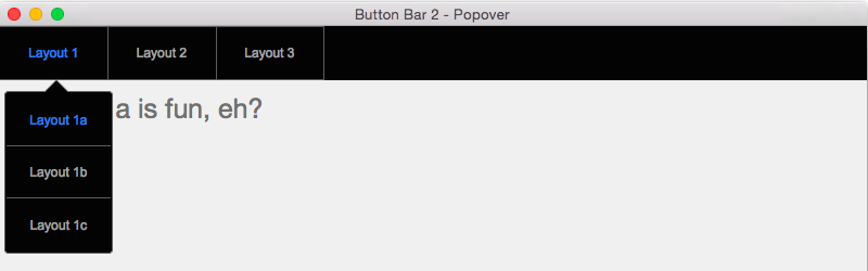
Note how this segment’s popover button contains another button bar (that nested button bar, though, won’t support a popover button). Very handy.
Action Menus
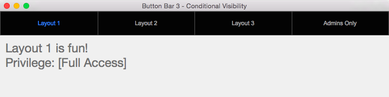
Moving away from navigation for a moment, when space is tight, I’m often charged with making a variety of actions available to a user, but without cluttering up the layout with buttons. Button bar to the rescue! How about a simple action gear (that is actually a popover button), that contains a button bar, where each segment of the button bar triggers a different script? This can be especially useful to diminish the visual importance of infrequently used actions, yet make these lesser features easier to find by collecting them together in one place (safety in numbers).
Note how the button bar can extend vertically instead of horizontally! Very cool. I wish portals were bi-directional like this.
Managing Button Bars
With that action menu example, you might be a bit suspicious. Wasn’t that possible in FileMaker 13 with a popover button and a few buttons (rather than button bar segments) contained within the popover? Functionally, yes; and you could probably come up with a lot ways to tackle the problem. But button bars will thrive in this functional space. Each clickable segment naturally extends edge-to-edge, until it hits previous/next button. So no pixel-perfect resizing (or opportunity for error) on your part.
Then there is the afore-mentioned ability to interact with a button bar or one of its segments at your leisure, without having to ungroup/regroup a cluster of buttons.
And button bars support a rich suite of style aspects (including distinct aspects for the entire object, the dividers between segments, the segments, and an icon), making it easy to change various cosmetic attributes and have changes apply to each segment consistently.
Conditional Visibility
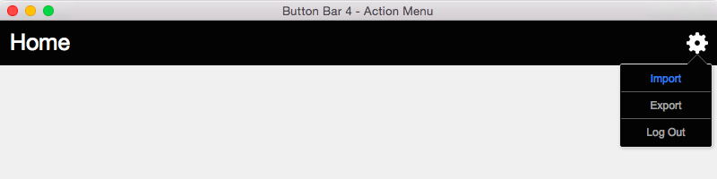
Getting back to navigation, I had a solution years ago that supported a diverse user base. Each privilege needed access to a subset of layouts, and each privilege needed to see their unique subset of navigational options in a different order, to better represent their own workflow. At the time, I solved this by using a repeating global field that would load a distinct set of visible options and underlying targets for each user, based on their privilege. I now know there are better ways I could have done this even then, but now I could just use a button bar.
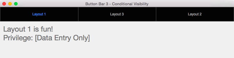
Each segment of a button bar supports conditional visibility. If a segment qualifies to be hidden (e.g., because the user’s privilege shouldn’t be seeing that segment as an option), the other buttons widen to fill in the gap. With a little bit of trickiness I can even get the buttons to appear in a different order for each privilege (note the position of Layout 2 for the two privileges above).
Record Navigation
What if we want a hybrid list view/form view, such that the user can click an item on the left, and see its details at right? The user should be able to scroll through and search the list. This is a classic interface metaphor that we might tackle with one or more portals, or perhaps with some repeating fields to simulate the list component, with some additional heavy lifting for the search feature. A button bar might be the perfect fit.
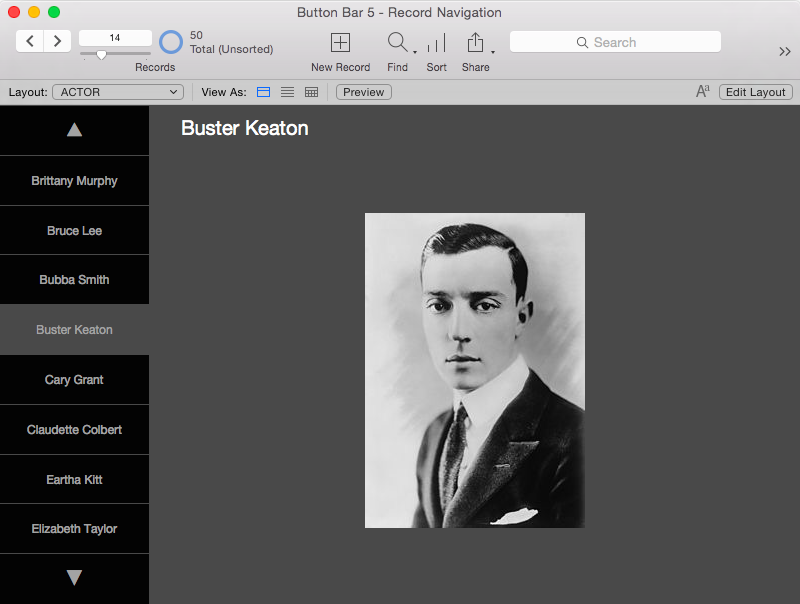
A vertical button bar, though not as list-ready as a portal, can be made to support vertical cycling through a list of values. The visible segment name can be a calculated result, so it can change dynamically in response to user clicks (with a little help from the Refresh Object script step). Now, this is a bit of a hack, trying to get a button bar to behave like a portal, which gives us vertical scrolling for free. But consider what we get for free in exchange: native search and navigation. We’re still sitting on data records, so the user is free to perform a find, use quick find, or otherwise modify their found set, and to use toolbar/keyboard/menu navigation to move between records. A button bar can keep up with these state changes without much effort or overhead.
This mockup leverages a single button bar object and a single, relatively simple script. No relationships, no extra fields. That’s a lot of bang (that plays well with native functionality) for very little effort.
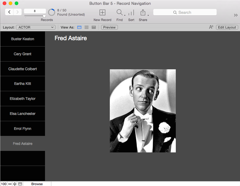
Note how the first and last segments are smart enough to toggle between showing data, and functioning as up/down buttons, depending on found count and record position. Likewise the segments know to become inert when there aren’t enough records in the found set to necessitate their particular segment position (here I opt for inert rather than conditionally hidden segments, because I don’t want the size of buttons to change as the user modifies the found set).
Glyphs
Button bars (and buttons and popover buttons) also support a new layout resource called glyphs. A glyph is an icon associated with a layout object that can be paired with text (positioned in a variety of ways) or can stand on its own. FileMaker comes with a basic assortment of glyphs. Adding a new glyph is easy; once you add a glyph, it’s available on every layout in the solution.
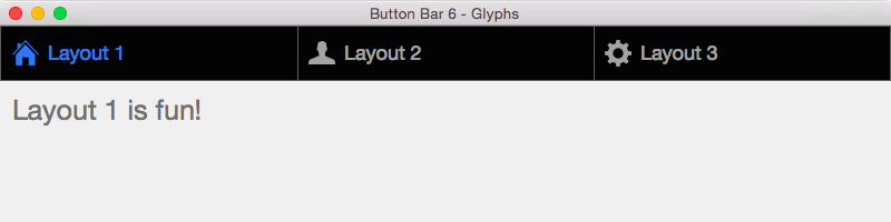
Unlike layering an icon on top of the button bar object, when glyphs are built in, they move and slide appropriately as the dimensions of the button bar change. Also, they respond to mouse events (e.g., OnHover) in synch with the rest of a segment. So hovering over the text of the segment will cause not only the text to light up, but also the icon. This creates a consistent user experience.
Here’s my sticking point with glyphs, though: they’re difficult to maintain. Glyphs exist outside of styles and themes (unlike the image fill attribute of various layout objects, which can saved to a style). I can’t update an existing glyph, nor can I instruct many objects all leveraging the same glyph to use a different glyph in its place. So if I want to change a glyph, I have to upload a new glyph, then remap every reference from the old glyph to the new. What a pain.
For that reason, I’ll probably use glyphs only sparingly. For a navigation button bar, for which I expect to be copying and pasting a revised object from one layout to the others, keeping glyphs in synch won’t be any extra work. For other types of button bars, though, glyphs aren’t exactly the resource library we need.
Other Applications
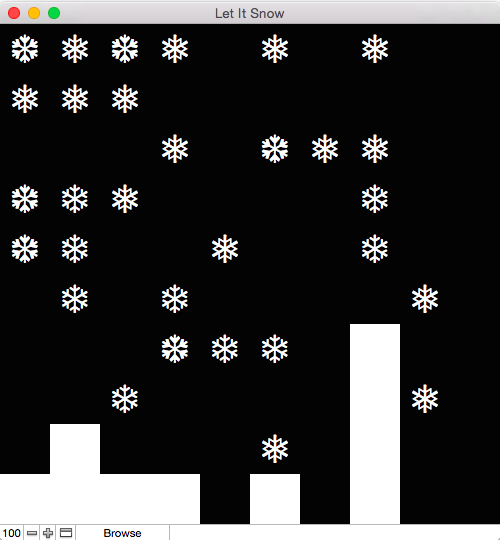
A common metaphor in board games is that of a grid, representing spatial relationships between cells of the grid. In the past, I’ve used repeating fields to manage chunks of the grid. A button bar might be an adequate substitute. In the Let It Snow game, represented by ten vertical button bars of ten segments each, try to catch as many snowflakes as you can before the snowdrift covers the screen.
You can download each sample file.
Great Post Will.