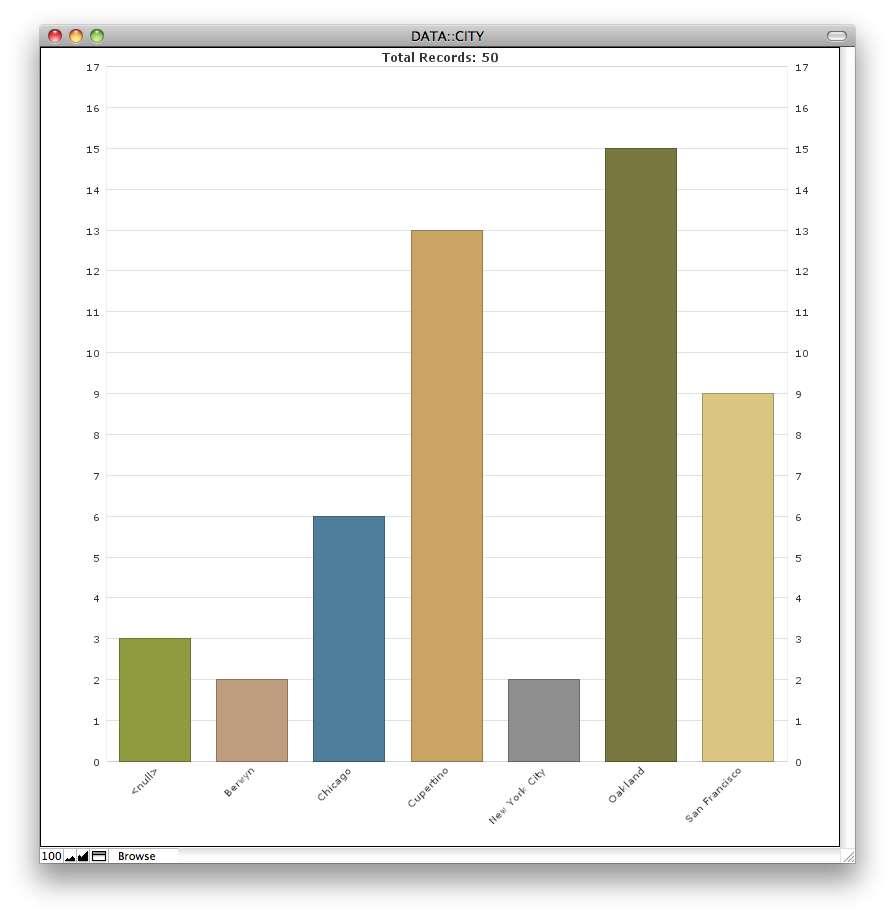
Neither I nor my client can anticipate every chart that the solution’s users might want to see. A user’s desire to view a high-level visual representation of their data can be spontaneous and idiosyncratic. This technique allows for the user to create an ad hoc chart, albeit within narrow parameters (i.e. the chart is simple, presents only counts of values, and is pre-formatted).
FileMaker File: ChartActiveField.fp7
Components
- Summary field. Each table needs a field called TABLE::SUMMARY to allow its data to be summarized.
- Chart object. Displaying delimited data from global variables.
- Script. Sorts the found set by the active field, then gathers counts of the records in each sub-summarized group. By using the GetSummary function, we avoid needing sub-summarized parts on the layout. (Credit to Bob Bowers of Soliant Consulting for bringing this summary-gathering technique to my attention.)
Gotchas
- Mac OS only. Uses an AppleScript to sort the records. Because we’re leveraging the active field, we have built-in assurance that the sort field is on the layout.
- The script assumes the summary field is called SUMMARY.
- As is, the script only supports charting a field whose table occurrence matches that of the layout’s context. The script must be enhanced to support charting data from a related field (and there would be further behavior considerations).
- Multiple instances of the chart, charting different data, cannot be viewed simultaneously. Running the script on a new field will stomp the values visible in any open chart.
- As the found count increases, the sort requires more time to execute. With 1,000,000 records on a local file, the sort requires 32.7 microseconds to complete.