Introduction
When you’ve been using FileMaker as long as I have, you know we’ve done all kinds of crazy things to get image masks to work on our buttons. For example, we would use a set of grouped native FileMaker line objects to cover an image just to get an ugly looking mask. I hope that not many developers suffered for too long using that technique.
Download Using Icons
More recently, we would load images from a library image table into a global repeating field on database-open. In fact, this whole discussion originated in our office regarding image library tables and how we could make better use of styles in FileMaker 13. I had suggested that we use a field in our FOCUS table to store images and give them a style. Then Will suggested not using a field at all. This meant we could get rid of our library image table and the global repeating field in our FOCUS table all together. This technique for reducing schema has been right under our noses and we were simply not exploiting it to the fullest extent.
Kudos to Brian Schick for blogging about new ways to consider Buttons as FileMaker layouts objects, and to Dawn Heady of Soliant Consulting for demonstrating a technique for faster loading buttons. If you’re familiar with web design, you may recognize this as functioning like CSS sprites or simply appreciate the benefits of the CSS underpinnings of the FileMaker 13 Platform.
Here’s how I went about implementing Button Image Masks in FileMaker 13:
Implementation
In layout mode create a square object. Click on the appearance tab in the inspector and set the fill to “image” and choose “scale to fit.” This same image is automatically set for Hover, Pressed, or In Focus as well.
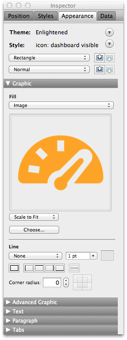
Now comes the fun part. Select an image file of the same image in a different color and set it for the fill for Hover and Pressed. We have been using images from iconsdb as it allows you to set the color for a transparent png. For my example I chose dark gray for the default (normal) image and blue for hover and orange for what I call “active.” The intended use for this new style would be to use it as part of a navigation tab. I created a new style from this rectangle called:
“icon: dashboard nav”
This style has the following attributes.
Dark Gray = Normal
Dark Blue = On Hover
Orange = Pressed
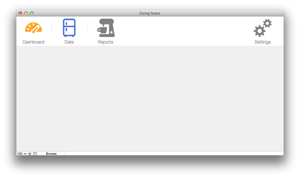
You must associate the rectangle with a script or script step via format–>button setup in order for the hover and pressed states to work. In my example file I associated the button with a navigation script. The cool thing about associating it with a script is that because the images are pngs with transparent background, your button now works as a button mask – meaning that only the image changes or lights up when you hover over it. This gives your solutions a much more polished and professional look to them.
Then I created another style called
“icon: dashboard visible”
This style is to show the image of the layout that is selected it just shows the orange image and doesn’t call any script or have any other available states.
So what have we accomplished with this? We’ve replaced an entire image library table and a repeating field in our FOCUS table. We also have a way to update a button with a new image in the entire solution with one step.
Hope you all enjoy this and let me know if you have any additional suggestions for this.