A colleague recently posed this challenge: is it possible to show two columns in a portal, such that the first row displays records 1 and 2, the second row displays records 3 and 4, etc.? With FileMaker, the answer is usually “Yes!”
The Challenge
Here are some clarifications of the challenge:
- The records must be displayed via a portal. I can’t use preview mode’s native column support, nor a web viewer, nor a collection of button bars, etc.
- The user must be allowed to interact with the data.
- When sorted, the data must be sorted left-to-right, top-to-bottom. This is the key reason I might want multiple columns to begin with, such that as I scroll the portal I’m advancing through the sort order. The alternative, sorted top-to-bottom, left-to-right, might put A-M in the lefthand column and N-Z in the righthand column, meaning that the ‘A’ and ‘N’ entries would be paired together in the vertical scroll. Sorting top-to-bottom first makes more sense if the entire found set can be viewed at once; otherwise left-to-right makes more sense.
Method 1 – Virtual Table
My first instinct was to use a virtual table (akin to a virtual list), such that each record in this virtual table looked to two records in the data table.
I won’t go into much detail here, because (spoiler) method 2 proved superior, but here are some nuances:
- The portal’s sort order is hard-coded.
- As an example of how to support finds, the sample file uses a custom menu to intercept Quick Find and Show All Records menu commands, to cache qualifying IDs in a global field, which the portal then leverages to display data just from the qualifying records.
- With the two-column format, there must be half as many virtual records as data records. The sample file doesn’t tackle the task of ensuring this ratio.
Visually and functionally this method satisfies the challenge’s requirements, but the structural overhead of the virtual table seems unnecessary, which leads me to…
Method 2 – Master-Detail Portal
Ah, FileMaker 17’s master-detail portal. So elegant; so powerful; so flexible. No more virtual table, nor relationships, nor custom menu, nor ID caching. Cosmetically, it looks the same as the virtual method, but there is more power underneath.
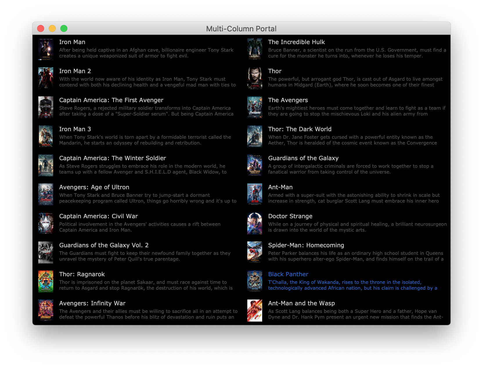
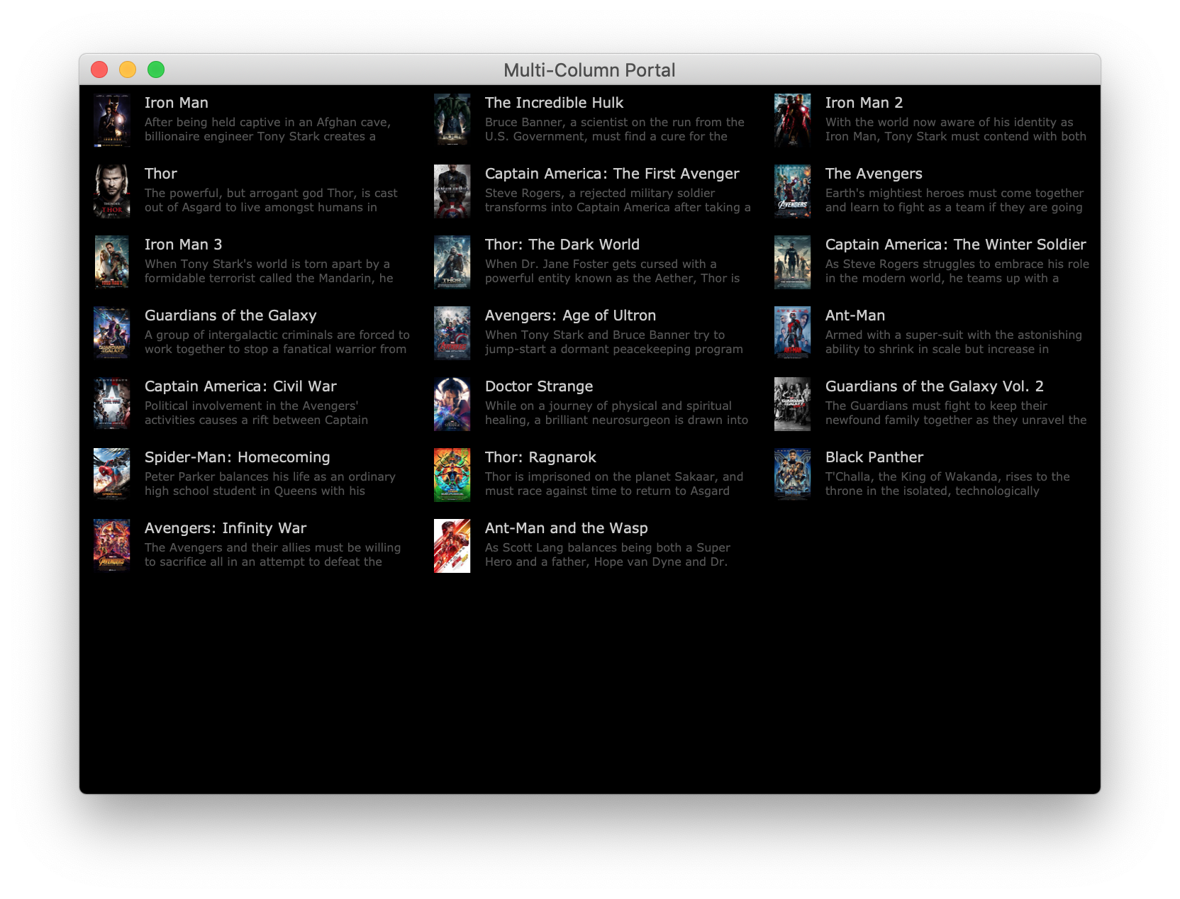
In this example, we have a found set of the 20 movies in the Marvel Cinematic Universe, sorted in release order, left-to-right, top-to-bottom. The layout is based on the MOVIE table occurrence, showing a master-detail portal of MOVIE records in the found set. The secret sauce is that each row of the portal is displaying data from other records in the found set, thus compressing 20 records into 10 visual rows. E.g., the Incredible Hulk record is the second row in the portal, yet is showing data for Iron Man 2 (record 3) and Thor (record 4).
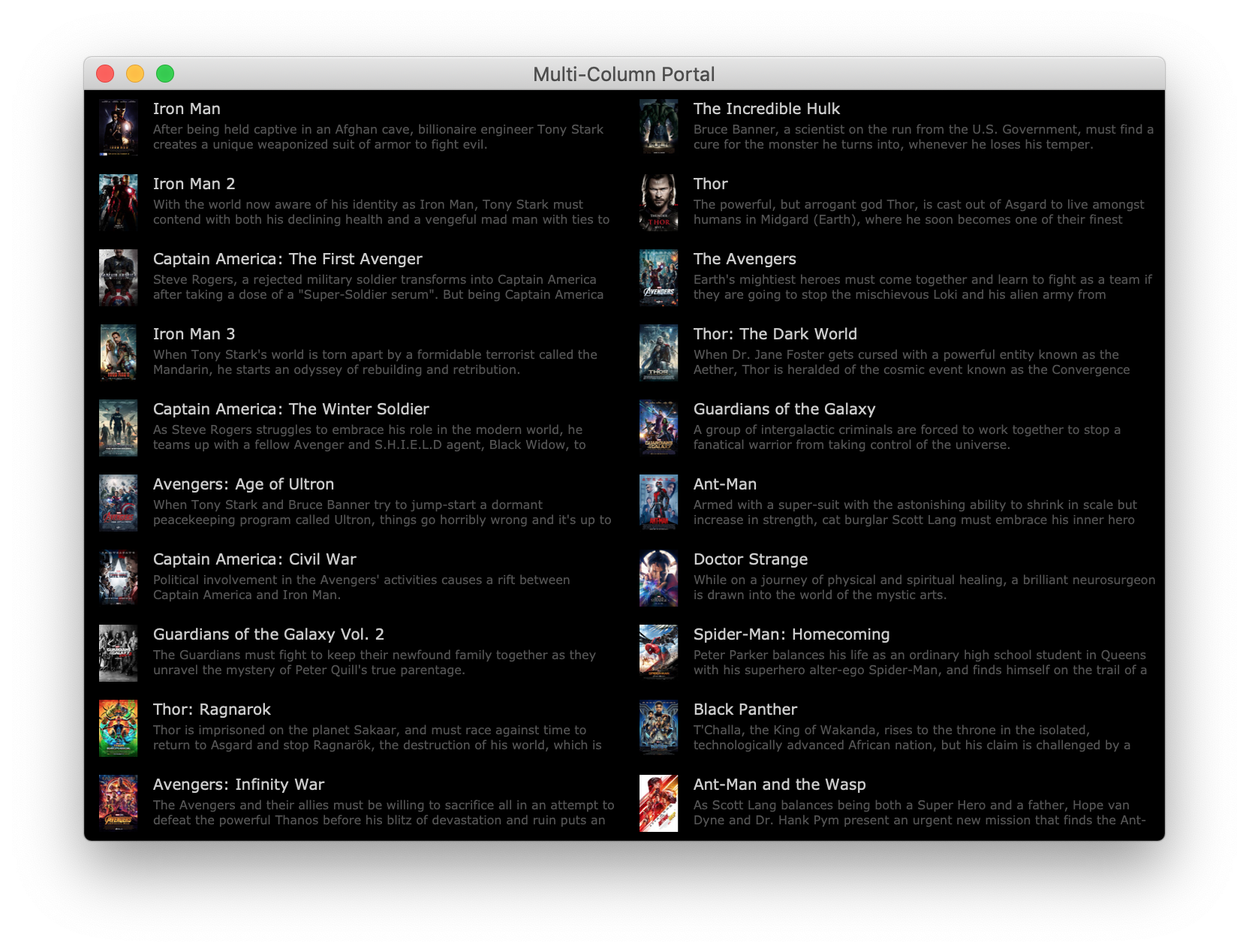
Gotcha: There is a flaw with this approach, exposed if you scroll the portal. Since there are actually 20 records in the found set, there must also be 20 rows in the portal. The first 10 rows show the data; the latter 10 rows are blank. That’s ugly and undesirable, but I decided it was still preferable to the virtual method.
Structure
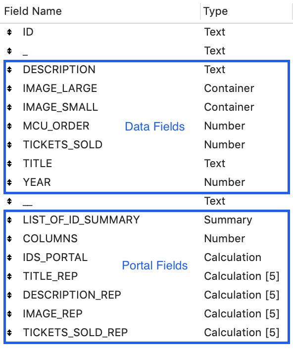
The structure is very simple, with a handful of data fields in the MOVIE table, and seven fields dedicated to this portal technique.
- LIST_OF_ID_SUMMARY is responsible for identifying the records in the found set. This empowers the user to manage their found set, yet still allows the application to detect which records have been found and in which order they’ve been sorted.
- COLUMNS… well, we’ll get to that.
- IDS_PORTAL is a simple calculation that extracts two IDs from the summary field, based on the record’s position relative to the found set.
- The four repeating calculations are the display fields, responsible for looking to a specific data field on a specific record. The first repetition populates the first display column; the second repetition populates the second display column.
Search
The master-detail portal supports native search, but the display columns in the portal aren’t search-friendly, so I use conditional visibility to hide the portal in find mode, exposing in its place the data fields that should be searchable.
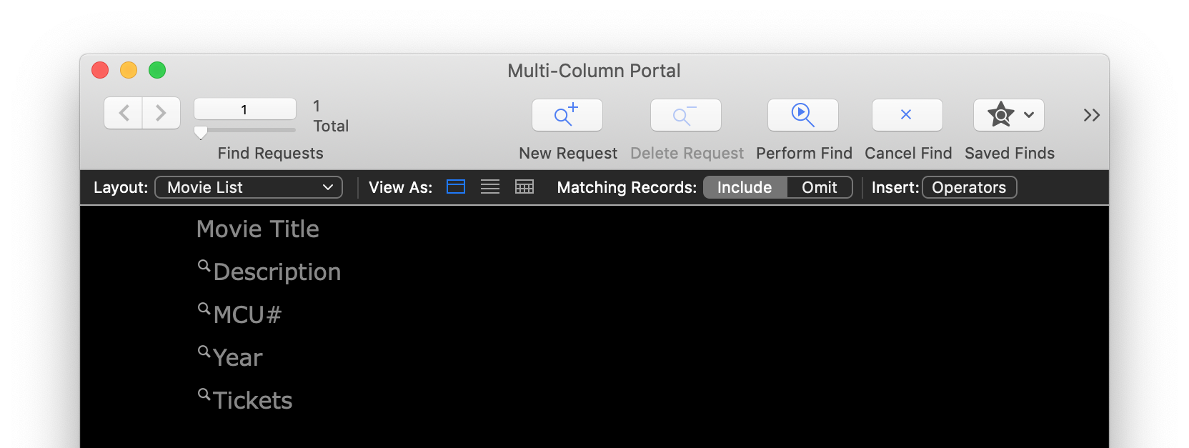
Similarly, I use off-screen fields to support quick find.
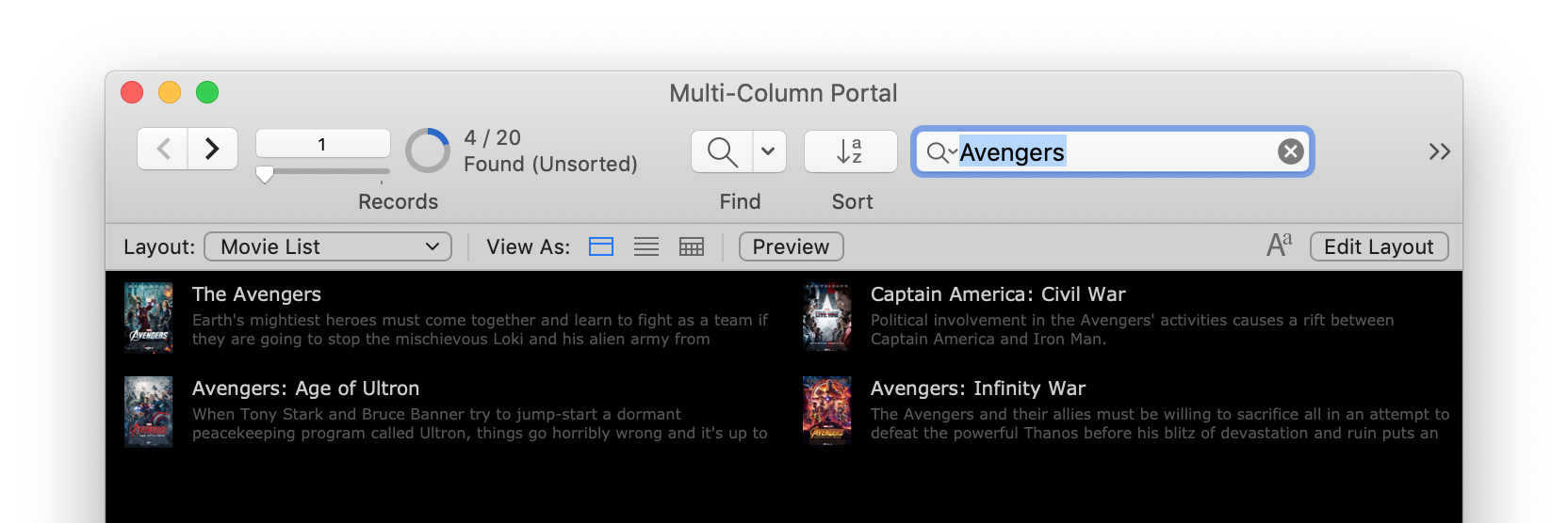
The user can sort the found set however they like, which will be respected in the static left-to-right, top-to-bottom flow.
Interactivity
One of the requirements of the challenge is to allow the user to interact with the data. I employ a rectangle object grouped with the display fields as a button, such that if the user’s cursor hovers over any part of the rectangle (even the movie poster or empty space around the fields), the OnHover condition of the title and description fields activates.
Each cell of the grid is using the IDS_PORTAL field to identify which particular record it represents. Therefore if the user clicks a cell, the button can pass that cell’s ID to the resulting card window.
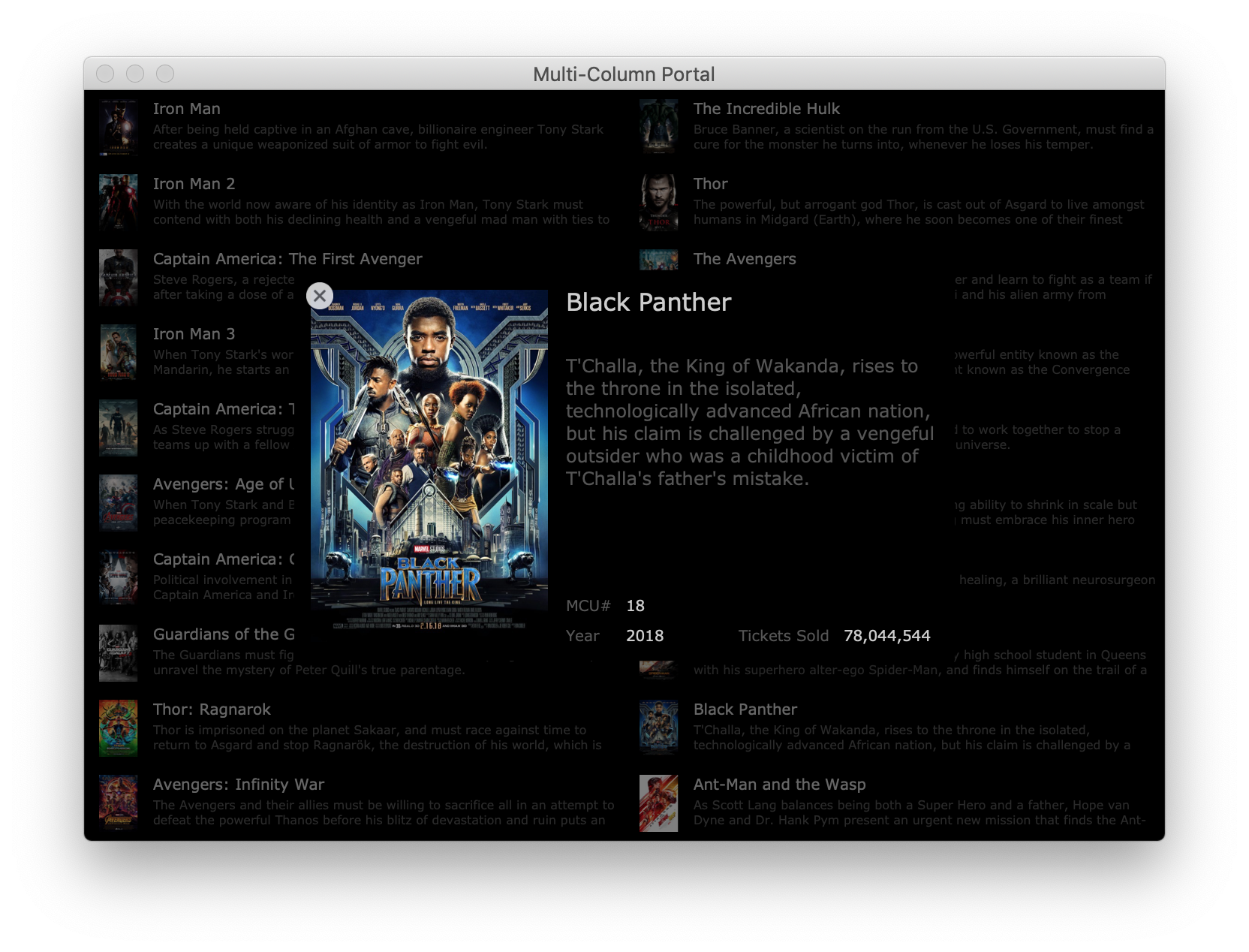
Note that because there are empty display rows/cells, a button must conditionally hide itself if its individual cell is empty, so as to not be clickable if the user happens to click around in the (undesirable) empty space below the visual data.
Multi-Columns
Naturally, though, if we can do two columns, why not more? And why not empower the user to choose the format that fits their need? Different numbers of columns allow us to emphasize different parts of the data, depending on the amount of space available for each record.
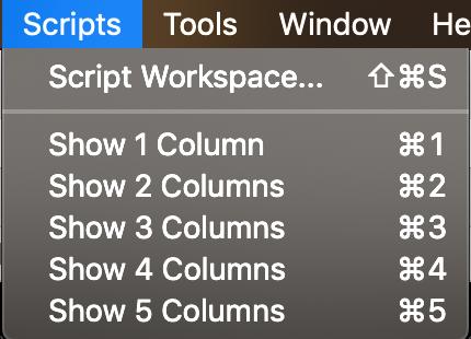
As a quick demonstration, this application exposes five Scripts in the scripts menu allowing the user to specify how many columns they want to display.
This approach uses stacked, conditionally visible portals, made so easy to manage via FileMaker 17’s Objects inspector.
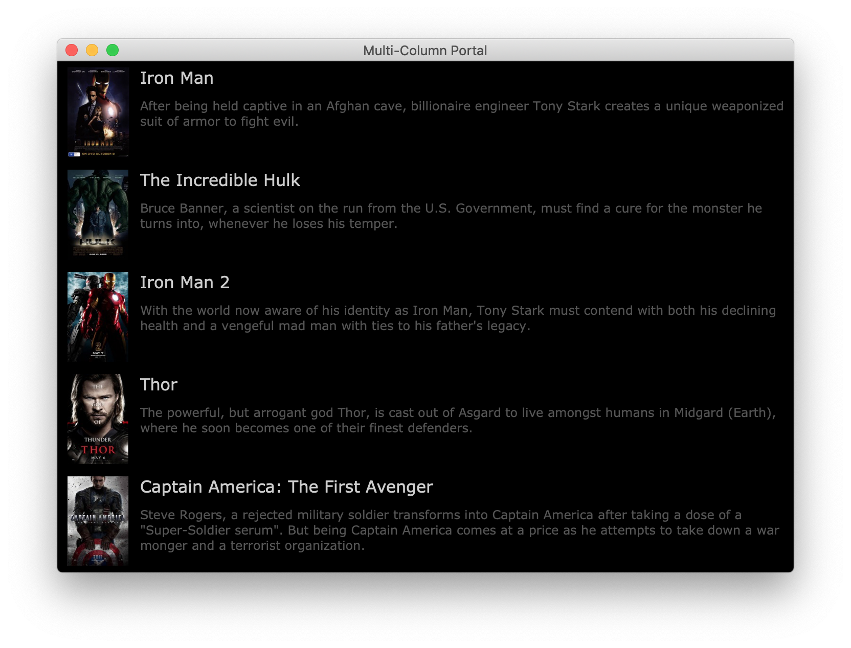
The 1-column portal is indistinguishable from a traditional related portal, and so here I simply leverage the data fields directly, rather than the calculated display columns. With only a single column, I decided to also double the height of the column to give the record some breathing room for a larger poster and fonts.
You’ve already seen the 2-column portal; the 3-column portal is similar, just more compressed.
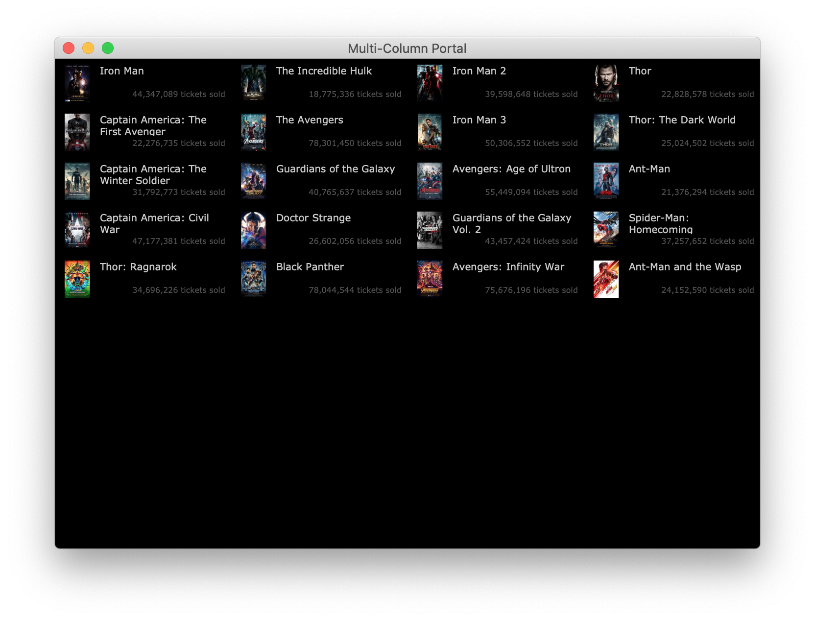
Once we get to the 4-column portal, there’s no longer enough space for the description field, so instead I display the tickets sold for each movie.
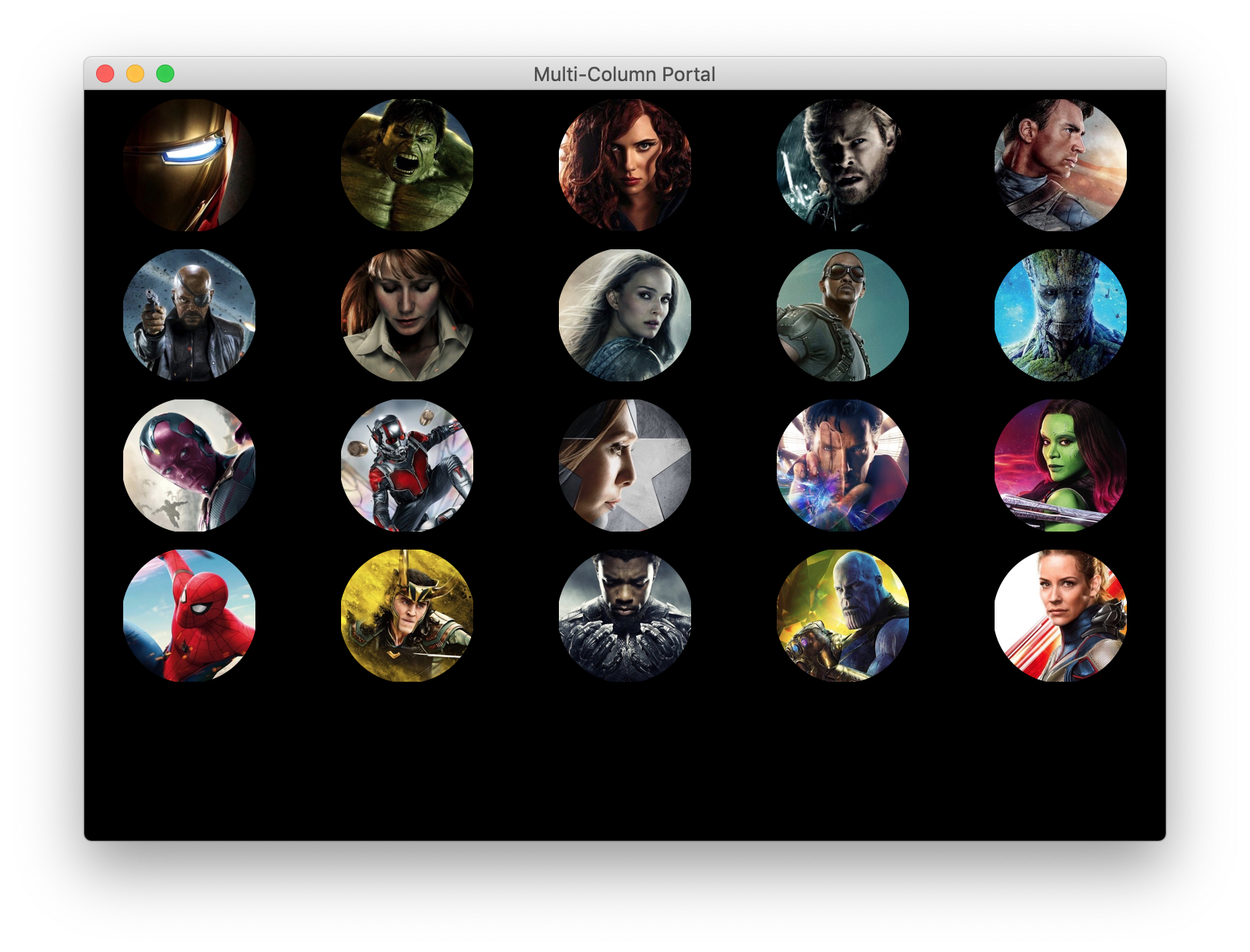
Once we get to a 5-column portal, space is so tight, I drop the text fields entirely. The display image is smart enough to switch to a backup image that focuses on an important character from each film. Rounded corners on the container objects make the images appear as circles.
Performance
At the top I mentioned that the left-to-right, top-to-bottom sort makes sense when there are more records than will fit in a single view. Yet my example above fits in a single view when configured to display two or more columns. So what happens when we add more data?
I tried switching from 20 movies to 1,917 actors, and everything slows… way… down.
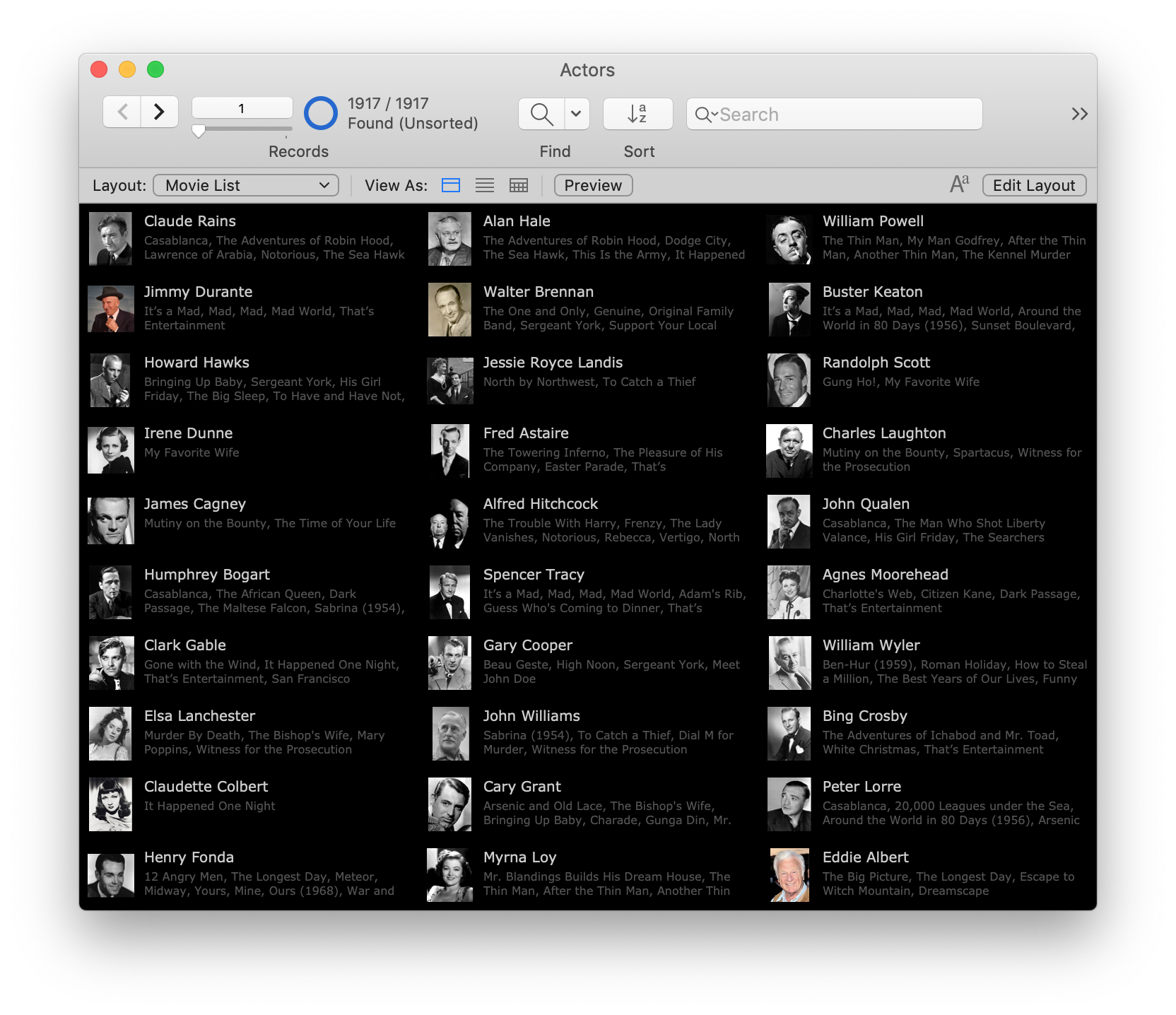
As I noted in my overview of Master-Detail Layouts in FileMaker, master-detail portals are quite performant, even across millions of records; more so than traditional related portals. But in this technique the display columns are all unstored calculations looking across the found set, so it throws those performance gains out the window.
If I cut the record count down to 500 the speed becomes tolerable (over LAN). Which, unstored calculations aside, isn’t much different from the upper limit I might place on a traditional related portal anyway.
Summary
So is this technique viable? There is little schema to support it; most of the complexity is in the layout objects (more complex if the number of columns are to be user-configurable). So long as there are fewer than 500 records in the target table, and there is some reason to see as many records simultaneously as possible, yeah, I think this could be a useful way to present the data.
As I mentioned at the top, had it not been for the specifics of the challenge, there are several other ways a developer could go about trying to solve the same problem. I appreciate, though, that the challenge’s constraints lead me to yet another use for the master-detail portal.